PyPlot: Graphs In Python Notes
Get the manual.
A brief look at the architecture.
Page Contents
Newer APIs
https://www.youtube.com/watch?v=OC-YdBz8Llw
Useful Links & References
- Matplotlib: plotting scipy-lectures.org. Oh man, now that I've found this page, it makes my notes page rather redundant for me LOL.
Basics
Import the library into your Python script:
import matplotlib.pyplot as pl
Some people like to import it as plt... I prefer pl.
Python's Matplotlib APIs
Figure | Axis | Lines | Legend |
Creating Plots, Current Figure, Current Axis in Python
Python's PyPlot works on the current figure and axis. All commands work to add plot elements to the current figure and axis. The function gca() returns the current axes (Axes object instance).
A figure and axes are created by default for any plot if you do not specify anything. Within the figure one default subplot (subplot(111)) is also created by default. It seems the function subplots(), plural is now the prefered way from various posts and comments I've seen... it offers more convenience.
Using subplots() you create the layout of subplots in one call and are returned the figure and axes objects (single axis or array if many subplots) for the plot. For example, creating a default graph with one subplot you do the following.
fig, ax = pl.subplots(nrows=2) # ax will be an array with 2 axis
This is just a little simpler than using the subplot() function where you would do the following.
fig = pl.figure(1)
ax1 = pl.subplot(211, 1)
ax2 = pl.subplot(211, 2)
Plot Returns A Set Of Lines
The function plt.plot() (and the axis plot function) returns a list of lines (Line2D instances). The line objects have properties settable using the setp() command or as keyword arguments when plot()ing the lines. Some useul properties:
| Property | Value Type |
|---|---|
| color | any matplot lib colour |
| label | any string |
| linestyle | '-', '--', '-.', ':' |
| linewidth | line width in points (float values) |
| marker | See marker styles |
For example, when plotting one line a list of size 1, containing one Line2D instance is returned. In the little snippet below I wanted to plot a set of data points and then plot a curve fit to that line, but display the curve fit using the same colour, just different line style:
fig, ax = pl.subplots()
fig.set_figwidth(15)
fig.set_figheight(10)
...<snip>...
#
# Plot the data points and get the line instance.
line, = ax.plot(xSeries, ySeries)
#   ^
#   Note: the comma here to unpack the returned list, otherwise line is
#         a list, not a Line2D instance
...<snip>...
#
# Fit two blended guassians to the data set
popt_gauss, pcov_gauss = opt.curve_fit(
                two_gauss_curves,
                xSeries,
                ySeries,
                p0=(1, 70, 1, 1, 80, 1))

h1, u1, s1, h2, u2, s2 = popt_gauss

#
# Get the colour used for the data set and plot the fitted curve in
# the same colour. If we didn't do this the curve fit and data would
# be in two separate colours.
lc = line.get_color()
lineFit, = ax.plot(xSeries, two_gauss_curves(xSeries, *popt_gauss))
#      ^
#      Note: the comma here to unpack the returned list, otherwise line is
#            a list, not a Line2D instance

ax.axvline(x=u1, linestyle="--", color=lc)
ax.axvline(x=u2, linestyle="--", color=lc)
ax.text(u1, h1, " h={:.2f}".format(h1), color=lc)
ax.text(u2, h2, " h={:.2f}".format(h2), color=lc)

#
# Set the colour of the curve fit we plotted and the linestyle
lineFit.set_color(lc)
lineFit.set_linestyle('-.')
Set The Figure Size
fig.set_figwidth(15)
fig.set_figheight(10)
Get X/Y Axis Limits
Wanted to get the X or Y axis limits as used for the graph. This isn't always the min/max of the axis data series so use the functions get_xlim() and get_lim()...
ax.get_xlim() # Get x-axis limits as a tuple (min, max)
ax.get_xlim() # Get y-axis limits as a tuple (min, max)
Adjust The Major And Minor Grids
Inspired by this SO answer.
I wanted to be able to increase the ganularity of the the grid so that I could have a guide for every unit increment on the x-axis, as the current grid was a little too "broad". The grid displayed by default just shows guide lines for the major ticks. The solution is to add in minor ticks as well.
I wanted to set the minor x-ticks, based on whatever scale pyplot had decided to use for the x-axis, so used get_xlim() to get the x-axis limits. Then using get_xticks() I was able to find the number of major ticks and therefore the gap, in units, between each major tick, and thus create the positions for the minor ticks at unit intervals. The function grid() lets you select whether you show the major, minor, or both ticks and lets you set the transparency of the grid lines as well...
fig, ax = pl.subplots()
...<snip data plotting stuff>...
# Note: All data series must have been plotted at this point!
xAxisMin, xAxisMax = ax.get_xlim()   # Get the min/max limits of x-axis as chosen by pyplot to fit data
xRange = xAxisMax - xAxisMin
numTicks = len(ax.get_xticks())      # Get the number of major ticks on the x-axis
majorTickWidth = xRange/(numTicks-1) # Figure out number of units between each tick
xMinorTicks =                        # Create the minor tick positions in x-axis coordinates
    np.linspace(                     # and then set them
        xAxisMin,
        xAxisMax,
        (numTicks - 1) * majorTickWidth + 1)
ax.set_xticks(xMinorTicks, minor=True)
ax.grid(which='minor', alpha=0.5)    # Show minor ticks slighly duller than the major ticks
ax.grid(which='major', alpha=0.75)
View Port
Set the axis view port using plt.axis([x-min, x-max, y-min, y-max]) function.
Basic Annotation
Titles, labels etc
Use .title() to set the graph title, .xlabel() tp set the x-axis label, .ylabel() to set the y-axis label and .legend() to add a legend. .grid() also useful to add a grid to plot.
Adding Horizontal And Vertical "Guides"
Use axvline(x=...) to plot a vertical line across the axes. Use axhline(y=...) to plot a horizontal line across the axes.
Get All Axis Lines And Their Labels
If, for example, Pandas has plotted your graph and you want to get all the lines and their labels use this...
lines = ax.get_lines()
labels = [l.get_label() for l in lines]
Watch Out For Figure Persistence: Garbage Collection Of Figures!
The PyPlot interface to Matplotlib is stateful: it keeps track of every figure that you create so that you can always "get them back" in the Matplotlib style of things. Thus, to allow the garbage collector to free figure objects you must explicitly pyplot.close() them!
The following is a little example that shows this behaviour. Note, you might have been fooled into thinking that when the class was deleted, the figure and axis it owned would also be deleted, but as you can see they are not freed, even when garbage collection is forced. This is because PyPlot has its own references to these objects: it keeps track of every figure you create.
import matplotlib.pyplot as pl
import weakref
import gc

class A(object):
   def __init__(self):
      self.fig, self.ax = pl.subplots()

a = A()
aref = weakref.ref(a.fig)

print "There are {} figs".format(len(pl.get_fignums()))
del a
a = None
print "There are {} figs after del".format(len(pl.get_fignums()))

result = gc.collect()
print "GC collected {}".format(result)
print "Weak ref is... {}".format(aref())
print "There are {} figs after del & GC".format(len(pl.get_fignums()))

pl.close(aref())
print "There are {} figs after close".format(len(pl.get_fignums()))

result = gc.collect()
print "GC collected {}".format(result)
print "Weak ref is... {}".format(aref())
If, like me, you thought that the figure would be garbage collected after the del a; gc.collect() statements, you'd be wrong. You have to call pl.close(). Only after that can the figure be garbage collected successfully.
The programs output shows this:
There are 1 figs
There are 1 figs after del
GC collected 0
Weak ref is... Figure(640x480) # << The GC has NOT reclaimed the fig
There are 1 figs after del & GC
There are 0 figs after close
GC collected 2965
Weak ref is... None   # << The GC has reclaimed the fig
Sub Plots
Intro To Sub Plots
You can split up the figure into many different sub-graphs and these graphs can also share an axis and be laid out in all sorts of manners
The following example shows two subplot instances. Both the same except that in the first the x-axis are independent and in the second they are shared...
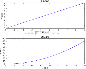
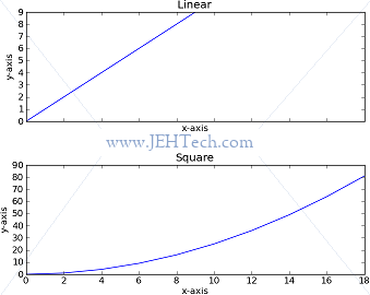
The code used to produce the two graphs above is as follows.
import matplotlib.pyplot as pl
import numpy as np

fig, ax = pl.subplots(nrows=2, sharex=True)
fig.subplots_adjust(hspace=0.4)

y = np.arange(10)
x = np.arange(10)

ax[0].plot(x,y)
ax[0].set_title("Linear")
ax[0].set_xlabel("x-axis")
ax[0].set_ylabel("y-axis")

ax[1].plot(x*2,y**2)
ax[1].set_title("Square")
ax[1].set_xlabel("x-axis")
ax[1].set_ylabel("y-axis")
Very useful is the subplots_adjust() function as I found sometimes the plots were bunched too close. This allows one to set the padding between plots and more...
Adjusting Subplot Positioning
Bar Graphs
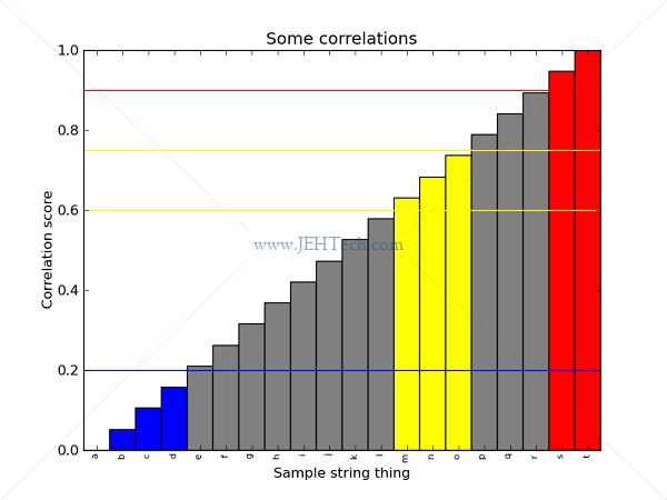
Here I wanted to create a bar graph of cross-correlation scores. Above the top threshold I wanted the bars to be one colour, between the top and a medium theshold I wanted the bars another colour, below the minimum threshold yet another colour and everything else in a different colour.
I also wanted the bar labels to be in the middle of the bars and for the text to be vertically stacked.
import matplotlib.pyplot as pl
import numpy as np

ycol       = [x for x in 'abcdefghijklmnopqrst']
corr       = np.linspace(0,20, len(ycol)) / 20
bar_coords = np.arange(corr.size, dtype='float64')
bar_width  = 1.0 # Note must have suffix '.0' to make it
                 # float otherwise div/2 is zero!

fig, ax = pl.subplots()
ax.set_ylabel("Correlation score")
ax.set_xlabel("Sample string thing")
ax.set_title("Some correlations")

#
# Create the bar graph... list of bars in graph returned
bars = ax.bar(bar_coords, corr, width=bar_width)
#             ^           ^     ^
#             ^           ^     scalar width of each bar
#             ^           heights of the bars
#             x corrdinates of left sides of bars


#
# Set the location of the x-axis bar labels to the center
# of each bar and rotate the text so it is vertical
ax.set_xticks(bar_coords + bar_width/2)            # Set xticks locations to center of bar
ax.set_xticklabels(ycol, rotation=90, fontsize=8)  # Set xtick labels

#
# Define thresholds for bar colouring...
upper_thresh        = 0.9
middle_upper_thresh = 0.75
middle_lower_thresh = 0.6
lower_thresh        = 0.2

#
# Draw thresholds on axes...
ax.axhline(y=upper_thresh,        color='red')
ax.axhline(y=middle_upper_thresh, color='yellow')
ax.axhline(y=middle_lower_thresh, color='yellow')
ax.axhline(y=lower_thresh,        color='blue')

#
# Colour the bars based on areas/thresholds of interest....
for bar in bars:
	height = bar.get_height()
	if height >= upper_thresh:
		bar.set_facecolor('red')
	elif height >= middle_lower_thresh and height <= middle_upper_thresh:
		bar.set_facecolor('yellow')
	elif height <= lower_thresh:
		bar.set_facecolor('blue')
	else:
		bar.set_facecolor('gray')
This produces the following plot...
Save Figure To File-Like Object Buffer
Sometimes, rather than saving a figure to a file, it is useful to save it to an in-memory file like object. The reason for this is that you might want to pass the image to some API without having to save it to a file.
For example you might be using docx to save the image as part of a MS Word document. The docx function add_picture() accepts either a file name or file-like object. So, to avoid creating the temporary image file you would do the following:
import io
# ... snip ...
buf = io.BytesIO()
fig.savefig(buf, format='png')
xdoc.add_picture(buf, width=Inches(6.0))
Scatter Plots
Create the graph as you normally would with fig, ax = pl.subplots(). Then plot the scatter point using ax.scatter([x], [y], color=colour, alpha=alpha, scale=scale, label=label).
If you plot all the points in one go per label, then the legend works as you expect... there is one entry for each colour with the colour's label displayed.
However, if you've added the scatter data point by point (which maybe isn't the thing to do?!), the legend will not group by colour but will display a separate entry for each scatter point. To fix the legend in this case you need to see the section on "Arbitrary Legends".
Legends
Arbitrary Legends
Made a scatter plot with coloured groups, but unfortunately plotted it point by point rather than passing arrays of points to scatterplot(), which may have been the wrong thing to do, butit was easier. Say there were 3 groups, one for a positive test, one for a negative and one for an equivocal result. How do I create an arbitrary legend with entries that are not related to a specific object in my graph?
The SO user "hooy" answered it perflectly here.
It is also very woth while reading the MatplotLib Legend Guide.
In summary it appears, whilst you can draw arbitary objects like a Circle onto a graph, you cannot draw arbitary objects onto the legend. An artist has to be created as he describes in his thread. Based on his example I had the following.
import matplotlib.pyplot as pl
import matplotlib.lines as mlines

... snip ...

pos_patch    = mlines.Line2D([0], [0], markerfacecolor='green', marker='o', color="white", label='Resistant')
neg_patch    = mlines.Line2D([0], [0], markerfacecolor='blue', marker='o', color="white", label='Sensitive')
fail_patch   = mlines.Line2D([0], [0], markerfacecolor='red', marker='o', color="white", label='No signal')
unsure_patch = mlines.Line2D([0], [0], markerfacecolor='purple', marker='o', color="white", label='Equivocal')
ax.legend(handles=[pos_patch, neg_patch, unsure_patch], numpoints=1)
The interesting thing, that other posts seemed to miss out was passing numpoints=1 to legend(). If you don't pass this is you get an annoying double circle.
Modifying The Legend Font
Often I want the legend to take up less space. To do this, make the font smaller as follows:
from matplotlib.font_manager import FontProperties
# ... snip ...
fontP = FontProperties()
fontP.set_size('small')
# ... do some plotting ...
ax.legend(..., prop=fontP)
Layout And Position
You can specify the number of columns for the legend layout using ncol=. You can specify where in the graph the legend is plotted using bbox_to_anchor= and loc=.
bbox_to_anchor describes where in the plot the edge specified by loc will be placed. The coordinate system is [0, 1], i.e., the coordinates are normalised across the extent of the graph and so are independent of the x/y coordinate system used for the plot itself.
For example,
bbox_to_anchor=[0.5, 1.0],
loc='upper center'
Tells pyplot to put the center of the upper edge of the legend box exactly half way along the graph horizontally and right at the top vertically.
Embedd In pyWidgets Apps
http://wiki.scipy.org/Cookbook/Matplotlib/EmbeddingInWx
http://matplotlib.org/api/backend_wxagg_api.html
http://matplotlib.org/examples/user_interfaces/index.html
http://stackoverflow.com/questions/10984085/automatically-rescale-ylim-and-xlim-in-matplotlib
http://matplotlib.org/users/event_handling.html
http://scipy-cookbook.readthedocs.org/items/Matplotlib_Animations.html