Cascading Style Sheets (CSS)
Page Contents
Useful Tools
A Naming Convention: Block, Element, Modifer (BEM)
References
- BEM 101, Robin Rendle, Mar 9, 2016.
Summary
Provides a consistent naming convention for CSS classes. The names provide a meaningful context from which the the relationship between the HTML and CSS can be more easily understood when reading through the code...
 .a-well-named-block { ... }
.a-well-named-block__element-in-block { ... }
.a-well-named-block__element-in-block--attribute { ... }
Cascading, Inheritance, Specificity
CSS style sheets use cascading + inheritance rules and the specificity rule to figure out what styles should be applied to an element.
References
- Cascade and inheritance, MDN Web Docs.
- Specificity, MDN Web Docs.
Specificity
When different rules could apply the the same element. E.g:
<!-- HTML -->
<h1 class="jeh">My Title</h1>

<!-- CSS -->
h1 { color: red; }     << THIS IS APPLIED (ITS THE MOST SPECIFIC) EVEN THOUGH...
.jeh { color: blue; }  << ...THIS WAS DECALRED LATER (IT IS LESS SPECIFIC)
Specificity most specifict to least. Most specific rule applies:
- HIGHEST: Inline rules
- HIGH: ID selectos (#the_id)
- MED: Class selectors (.myClass etc) and attribute selectors ([type="radio" etc])
- LOW: Type selectors (h1 etc) and pseudo-elements (::before etc)
Universal selector (*) has no effect on specificity. Like its the lowest.
Inheritance
Some child elements can inherit CSS properties from their parents. The "width" property is not inherited, for example. You can see a full list here.
Properties can accept one of "inherit", "initial", and "unset".
- Inherit - Gets property value from its parent
- Initial - Gets the initial (i.e., DEFAULT) value of that property
- Unset - Resets the property to its natural value, which means that if the property is naturally inherited it acts like inherit, otherwise it acts like initial.
Cascading
Order of rules with same specificity detmines which is applied - last defined used.
h1 { color: red; }
...
h1 { color: yellow; } << THIS IS APPLIED
Cascading also has to consider specificity and inheritance. The application of rules is done using the following importance:
- HIGH: Importance
- MID: Specificity
- LOW: Source order
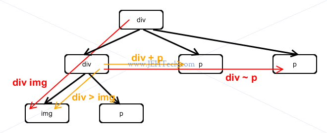
Selector
A great guide is (obvs) Mozilla, and the definitive is W3C.
| Selector example | Meaning |
| .className | Selects all elements with class name "className" |
| .className1.className2 | Selects elements with both classnames "className1" and "className2". Note that there is no space between the end of the first class name and the subsequent dot. |
| element.className | Selects the HTML element type with the corresponding class name |
| id1, id2 | Select both. Here idX can either be an HTML element tag or a class name (i.e., ".className".
Selects all nodes identified by idx1 or idx2.
|
| id1 id2 | Any descendant. Here idX can either be an HTML element tag or a class name (i.e., ".className".
The two identifiers are seperated by a space. This selects all elements identified by id2
that are a descendents (i.e., children, grandchildren and so on) of nodes identified by id1.
|
| id1 > id2 | Immediate child. Here idX can either be an HTML element tag or a class name (i.e., ".className".
The two identifiers are seperated by a > symbol. This selects all elements identified by id2
that are immediate children of nodes identified by id1.
|
| id1 + id2 | Immediate sibling. |
| id1 ~ id2 | General sibling. |
| [attribute] or [attribute OP value] | Selects all nodes with the attribute name specified inside the square br=ackets set.
Additionally the attribute selection can be further refined based on its value using
the operators = (equals), ~= (containing a whole word), |= (starting with), ^= (begins with),
$= (ends with), *= (contains substring). E.g., "[target=_blank]
selects node that have a target attribute and then only those where the
attribute equals _blank.
|
| id:first-child(n) | Selects any node identified by id that is the first child of its parent. |
| id:last-child(n) | Selects any node identified by id that is the last child of its parent. |
| id:nth-child(n) | Selects any node identified by id that is the n-th child of its parent. |
| id:nth-col(n) | Selects any node identified by id that is a cell belonging to the nth column in a grid/table. |
There are an absolute load more - see the W3C link above. These tend to be ones I have most often used.
Also, note that you can chain some of the pseudo classes. For example button:hover:disabled
applies a style to a button that has the mouse cursor over it and that is also disabled.
Calculating Element Properties
Creating Variables
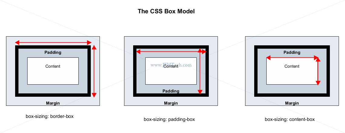
Box Model
See the W3C's CSS Box Model Module.
Sizes
Absolute sizes like pixels (px) or percentages don't scale well if, for example, the user
zooms in. When the user zooms in the default font size will change so anything we didn't spec a font size
for will get larger, but stuff we did spec a font size for using pixels or points will not change size,
which mucks up the design.
Other units can be used.
em: A font relative size. It is calculated from the inherited size (from one of the ancestors, or if not inherited the default text size). The resulting size isinherited-size-px * em's. I.e.emis relative to inherited size. BUT, BE CAREFUL:eminherits the previous sizes so if the oldest ancestor is20px, the parent1.5emand the element2em, it's size is20px * 1.5 * 2!rem: Root em. A font relative size. Likeemexcept that the size does not "stack" up like it does withem. Instead the text size of the root element (thehtmlelement) is always used and multipled by theremfactor. If thehtmltag does not have a size set then the default browser size is used.vh: Viewport (visible portion of website in browser window) height. Units in percentage: 0vh to 100vh. Allows the use of the viewport height, rather than using a relative unit against the containing block!vw: Viewport width. Units in percentage: 0vw to 100vw.vmin: Viewport min: takes the minimum of viewport width and height. I.e.vmin = min(vh,vw). Units still percentage.vmax: Viewport max: takes the maximum of viewport width and height. I.e.vmin = max(vh,vw). Units still percentage.
REM v.s. EM
The pros of rem: Simplifies the calculations, rather than having to stack ems.
The cons of rem: Hinders making components modular
The pros of em: Allows us to make modular components.
The cons of em: Complex to calculate the "stacking" of scaling factors.
Positioning Elements
References
- CSS Positioned Layout Module Level 3, W3C Working Draft, 19 May 2020.
- Absolute, Relative, Fixed Positioning: How Do They Differ?, Chris Coyier, Apr 24 2020.
- Absolute Positioning Inside Relative Positioning, Chris Coyier, Jul 24 2020.
- position: sticky;, Chris Coyier, Jun 21 2017.
- Normal Flow, MDN Web Docs.
- Positioning, MDN Web Docs.
- Layout and the containing block, MDN Web Docs.
- REM vs EM – The Great Debate
Flow and Types Of Positioning
Normal flow specs how block and inline elements interact - how they are placed inside the browser's viewport.
Block level elements occupy the entire space in the row in which they are positioned. They follow the "document flow". They have 100% width of parent element and are as tall as their content. Thus block elements laid out vertically and appear on new lines.
Inline elements as wide and as tall as their content. Cannot have width or height set - only for block level. Inline elements sit on same line as one another and adjacent text elements. They can be wrapped to next line if space runs out.
Margin collapsing: If two adjacent elements both have the margin set on them and the two margins touch, the larger of the two remains, and the smaller one disappears.
Types of positioning:
| Types | Descr |
| STATIC |
Means "put the element into its normal position in the document layout flow". Position percentages apply only to the content of the ancestor, and unlike, absolte positioned elements, the padding of the ancenstor is not included in the calculation. Ancestor is the closest one that is a block level element. |
| RELATIVE |
Similar to static positioning, except that once the positioned element has taken its place in the normal layout flow, you can then modify its final position, including making it overlap other elements on the page. Position percentages apply only to the content of the ancestor, and unlike, absolte positioned elements, the padding of the ancenstor is not included in the calculation. Ancestor is the closest one that is a block level element. Note there is an issue when using % with height!. If the containing element - i.e., the first ancestor that is block level, does not have a height defined, it may not be able to use the heightand you'll get a height of zero! Whatch out for this! |
| ABSOLUTE |
Takes element OUT of the normal flow - where the element would be in normal flow, other elements will now take its place. An absolutely positioned element no longer exists in the normal document layout flow. Instead, it sits on its own layer separate from everything else. The containing block is now the ancestor, so the sizing is related to the ancestor content plus the padding!. See section on containing blocks. It is the closest parent, grandparent etc with a position that is not static. Otherwise it is the window if no such parent exists. |
| FIXED |
Like absolute positioning, except that where absolute positioning fixes an element in place relative to its nearest positioned ancestor, fixed positioning fixes an element in place relative to the BROWSER VIEWPORT. Sizing using percentages are thus relative to the browser viewport. I.e. the containing block is the viewport. |
| STICKY |
Hybrid between relative and fixed position. Allows a positioned element to act like it is relatively positioned until it is scrolled to a certain threshold point, after which it becomes fixed. |
Relative & Absolute Positioning - Positioning Contexts & Containing Blocks
Relative positioning does NOT take objects out of the document flow, where as, absolute positioning takes objects OUT of the document flow.
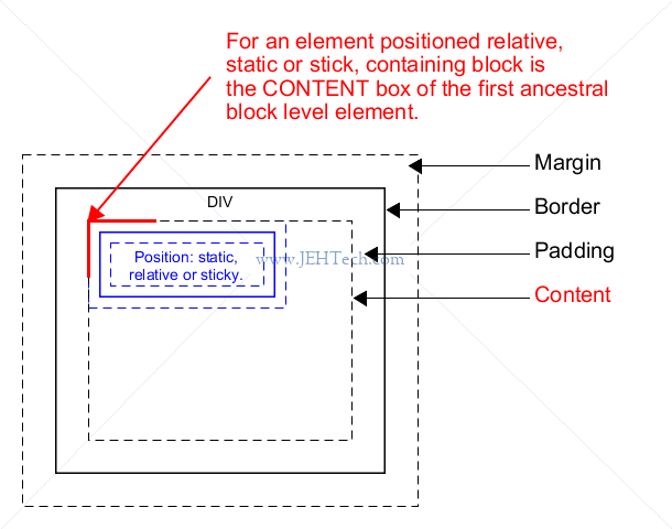
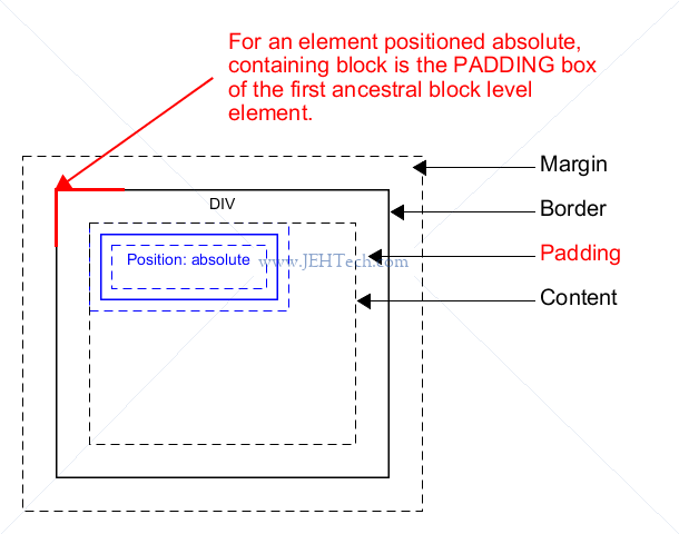
Every element is drawn inside a box - see the section on the box model. Size and position often determined by the content area of the containing block - the nearest ancestral block-level element, but not always (e.g. above we saw that absolute positions elements take the padding of the containing block into account).
Identifying the containing block
The process for identifying the containing block depends entirely on the value of the element's position property:
If the position property is static, relative, or sticky, the containing block is formed by the edge of the content box of the nearest ancestor element that is either a block container (such as an inline-block, block, or list-item element) or establishes a formatting context (such as a table container, flex container, grid container, or the block container itself).
If the position property is absolute, the containing block is formed by the edge of the padding box of the nearest ancestor element that has a position value other than static (fixed, absolute, relative, or sticky).
If the position property is fixed, the containing block is established by the viewport (in the case of continuous media) or the page area (in the case of paged media).
If the position property is absolute or fixed, the containing block may also be formed by the edge of the padding box of the nearest ancestor element that has the following:
- A transform or perspective value other than none
- A will-change value of transform or perspective
- A filter value other than none or a will-change value of filter (only works on Firefox).
- A contain value of paint (e.g. contain: paint;)
-- Layout and the containing block, MDN Web Docs.
Containing block for static/relative/sticky:
Containing block for absolute
Positioning context is defined in 2 cases:
- If no ancestor has position property applied then context is the
<html>element - Else, the closest ancestor with a position property becomes the positioning context. So, normally the closes ancestor will have a "relative" position property.
In the example below, div 2a is positioned absolute, and its positioning context is
div 2. Div 3a is also positioned absoute, but because no parent has an absolute or relative
position its positioning context is the <html> element.
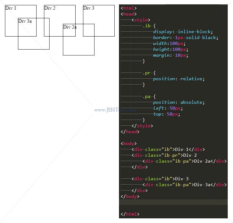
For "fixed" positioning the positioning context is the VIEWPORT.
Centering With auto
Use margin: auto; to center block level elements that have a defined
width. It won't work if width isn't defined or for floating, inline or absolutely elements.
This is the most common use of margin auto we come across often. By assigning auto to the left and right margins of an element, they take up the available horizontal space in the element's container equally – and thus the element gets centered.
Flexbox
References:
- Basic concepts of flexbox, MDN Web Docs.
Use display: flex; or display: inline-flex; to create a
flex container. Its child elements become, you guessed it, flex items.
Useful flex container properties:
flex-direction:Can berow[-reverse],column[-reverse].flex-wrap:Can benowrap,wrap,wrap-reverse.flex-flow:justify-content:align-content:align-items:
Useful flex item properties:
order:flex:align-self:
Flex Containers
A flex container has two axis: the main axis and the cross-axis, which is perpendicular to the main.
The flex-direction property dictates the origin and direction of the main axis.
Note also that the direction of flow along the axis is language dependent: in English it is left-to-right,
but in Arabic it would be left-to-right (assuming not a ...-reversed direction).
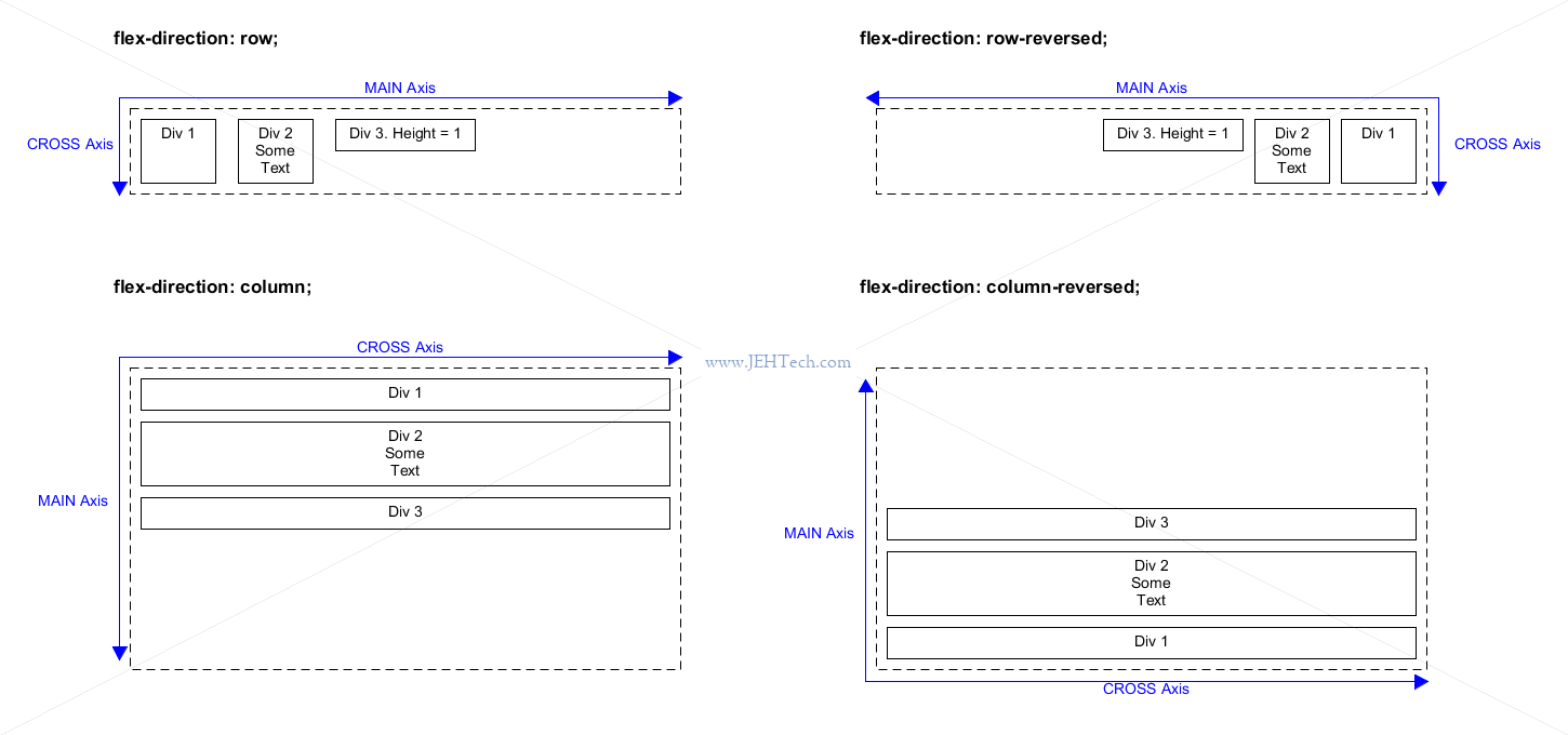
The following defaults for display: flex; apply:
- Items display in a row (the
flex-directionproperty's default isrow). - The items start from the start edge of the main axis.
- The items do not stretch on the main dimension, but can shrink.
- The items will stretch to fill the size of the cross axis (unless they have height specified).
- The
flex-basisproperty is set to auto. - The
flex-wrapproperty is set to nowrap.
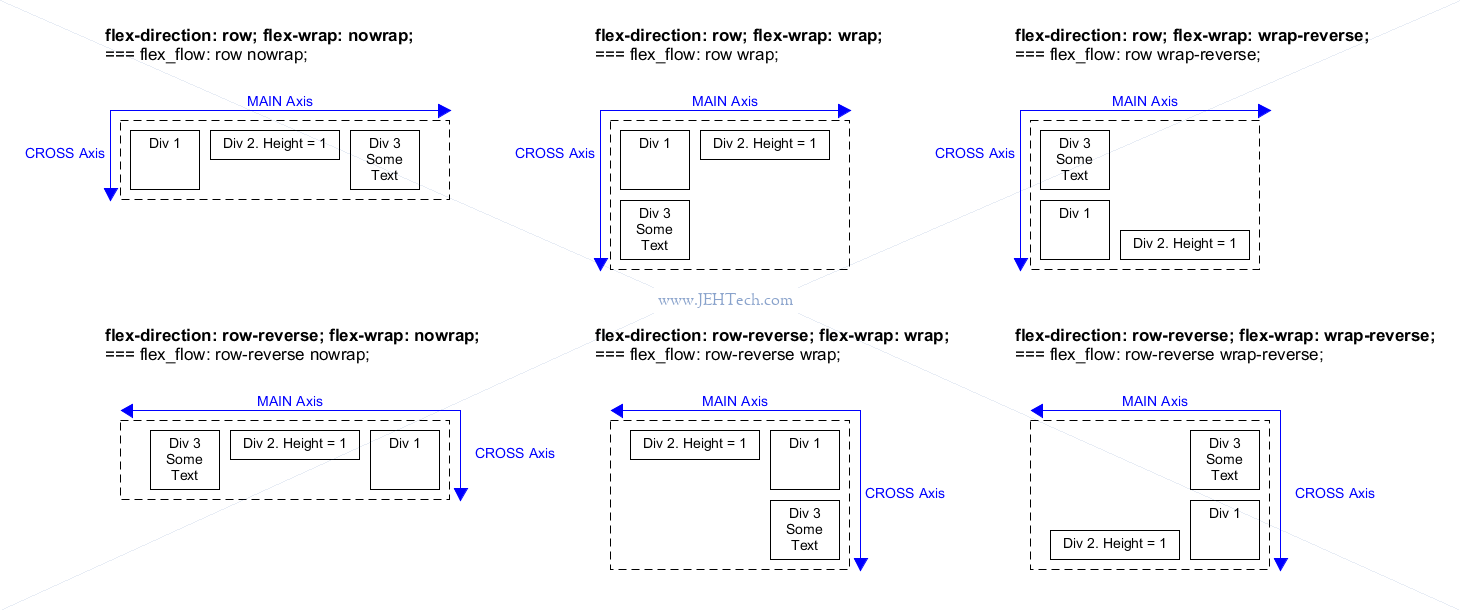
The property flex-wrap:... can be set to produce the following (default is nowrap):
We can also dictate how items align using the align-items CSS property. Default is
stretch. This makes the elements that do not have a height that is expicitly set
expand or stretch to fill the space available. The property align-items
always refers to the CROSS axis:
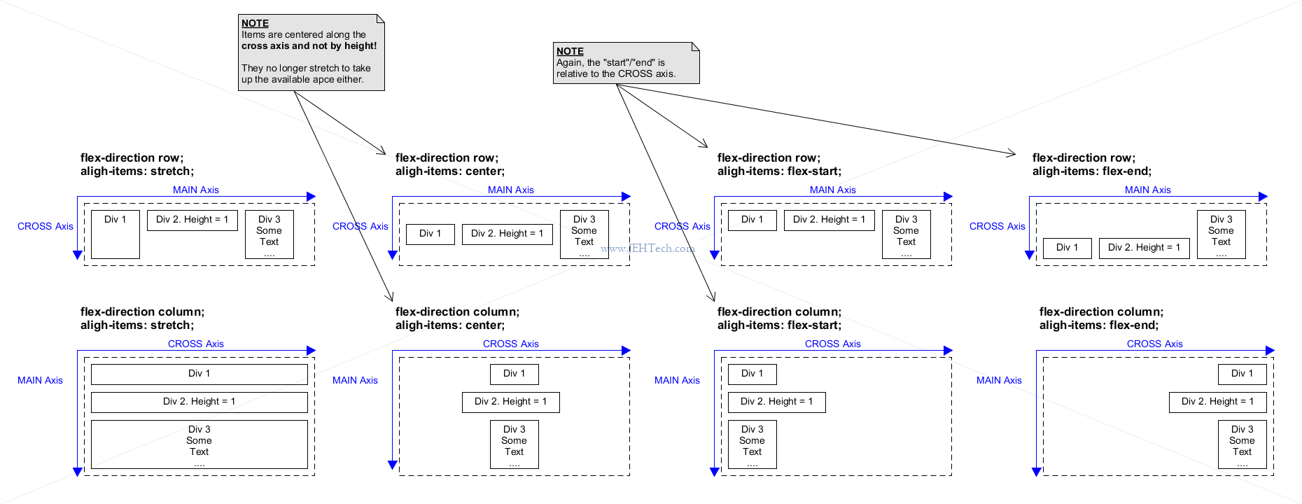
Other property values include baseline, which will align the flex items to
their content and not their box.
There is also the the property align-content that sets the distribution of space
between and around content items along a flexbox's cross-axis
.
To align content w.r.t to the MAIN axis use justify-content. It takes
the same property values as align-items and they broadly have the same effect
except w.r.t to the MAIN axis.
Flex Items
The same sort of properties that we saw above for flex containers, that apply to all items, can be overriden by the items themselves.
For example, flex items can use align-self: flex-start/end|center|stretch|...; etc.
The flex item property flex-grow can be used to make an item take up the remaining
space so that all of the main axis is taken up. The value of the property is zero by default,
which is like "off" Other values give the proprtion of the space to take up taking
into account other items that also grow.
The opposite of flex-grow is flex-shrink.
Grid
Create a grid container using display: grid; and specify the column widthss using
grid-template-columns and row heights using grid-template-rows.
.my_grid {
    display:               grid;
    grid-template-columns: col-width-1 col-width-2 ... col-width-n;
    grid-template-rows: row-height1 row-height-2 ... row-height-m;
}
Widths can be specified in any unit. There is a special unit, "fracton" (fr).
This unit allows the column to take up the remaining space available. When multiple columns have
fr units then they each take up their own proportion of the total fraction. E.g., if
col 1 has 1 fr and col 2 has 3 fr, then col 1 has a width of
25% and col2 has a width of 75%.
Elements will be laid out in the first row, column by column, and then onto the second
row and so on unless specifically positioned using grid-column-start: col-num.
To make it span more than one column add grid-column-end: col-num.
For example, to make a grid item start in column two and span two columns use:
.my_grid_item {
        grid-column-start: 2;
        grid-column-end: 4; /*< This is non-inclusive and also may be 1 past the last col */
        /* OR */
        grid-column-end: span 2;
}
The same applies for rows using grid-row-start and grid-row-end:
.my_grid_item {
        grid-row-start: 2;
        grid-row-end: 4; /*< This is non-inclusive and also may be 1 past the last row */
        /* OR */
        grid-row-end: span 2;
}
Of course, these can be combined to span multiple rows and columns together. You can also
use negative numbers!They start counting fromt the other side. So to span the remaining
space in a row could specific grid-end-column: -1, for example.
NOTE that grid elements can overlap if you specifically set the column and rows to overlap. Otherwise grid will try to avoid this. When overlapping it is the DOM order that determins which element is on top.
Useful CSS functions for defining grids include:
-
minmax(): give tracks a minimum size, but also ensure they expand to fit any content that is added. E.g.minmax(100px, auto)means automatically created rows/cols will be a minimum of 100 pixels tall, and a maximum of auto. Using auto means that the size will look at the content size and will stretch to give space for the tallest item in a cell, in this row. -
repeat(): represents a repeated fragment of the track list, allowing a large number of columns or rows that exhibit a recurring pattern to be written in a more compact form. E.g.,repeat(3, 1fr)is equivalent to1fr 1fr 1fr.repeat(auto-fill, 200px): create as many 200px rows/cols as will fit in container.The function
minmaxcan be used withrepeat:repeat( 12, minmax(250px, 1fr) );. This specifies a minimum width for each row/col. With only1frthe cell will squish depending on the size of the container. But with theminmaxaddition it will never squish to a size less then250px. This will not wrap, justify overflow the container if its not big enough.auto-fill FILLS the row with as many columns as it can fit. So it creates implicit columns whenever a new column can fit, because it's trying to FILL the row with as many columns as it can. The newly added columns can and may be empty, but they will still occupy a designated space in the row.
auto-fit FITS the CURRENTLY AVAILABLE columns into the space by expanding them so that they take up any available space. The browser does that after FILLING that extra space with extra columns (as with auto-fill ) and then collapsing the empty ones.
Gaps between rows and columns are defined using column-gap and
row-gap.
Align items inside a cell using align-items: (start|end|stretch);.
Rough n' Ready Notes
VIEWPORTS
=========
See https://developer.mozilla.org/en-US/docs/Web/CSS/Viewport_concepts

A viewport represents the area in computer graphics being currently viewed. In web browser terms, it is generally the
same as the browser window, excluding the UI, menu bar, etc. That is, the part of the document you are viewing.


MULTI-COLUMN LAYOUT
===================
See https://developer.mozilla.org/en-US/docs/Learn/CSS/CSS_layout/Multiple-column_Layout
    https://developer.mozilla.org/en-US/docs/Web/CSS/CSS_Columns/Using_multi-column_layouts

The the CSS properties "column-count", "column-gap", "column-rule", and "column-width". Just splits out
elements into columns. As one column space gets used up the context flows into the next column and so on.

EG
	.container {
	    column-count: 3;
 	    column-gap: 20px;
 	    column-rule: 4px dotted rgb(79, 185, 227);
	}

Elements can also span *all* columns (not a subset though) using "column-span: all" property.

To stop column content breaking in awkward places use CSS Framgmentation properties. EG
"page-break-inside: avoid".


MEDIA QUERIES
=============
https://developer.mozilla.org/en-US/docs/Learn/CSS/CSS_layout/Media_queries